How I course-corrected early UX missteps in Business Insider's CMS image library, cutting user complaints by 92% and enabling image-heavy publishing at scale.
🧩 Problem
The MVP image library shipped with disjointed UX and an unvalidated assumption: don’t block the writing space. The result was a cramped, error-prone interface that slowed editors down and eroded trust.
💡 Solution
Through iterative redesigns: popover → panels → full-screen modal, I created a focused, scalable image management experience that editors preferred, and that unlocked high-impact features like bulk upload and slideshows.
📈 Outcome
The redesign led to a 92% reduction in image-related user complaints and a 5x increase in CMS publishing velocity.
Editors quickly adopted the new bulk upload and slideshow features, accelerating workflows across image-heavy desks and expanding the CMS’s coverage of visual storytelling formats.
Timeline
3 years, Aug 2021 — Oct 2024
Team
6 PMs, 18 engineers
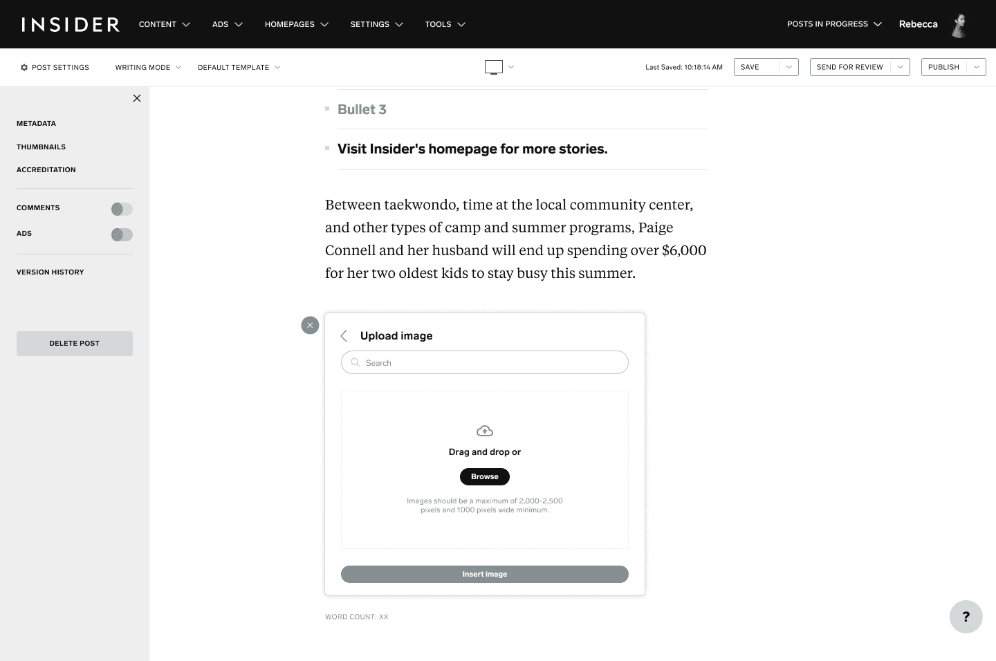
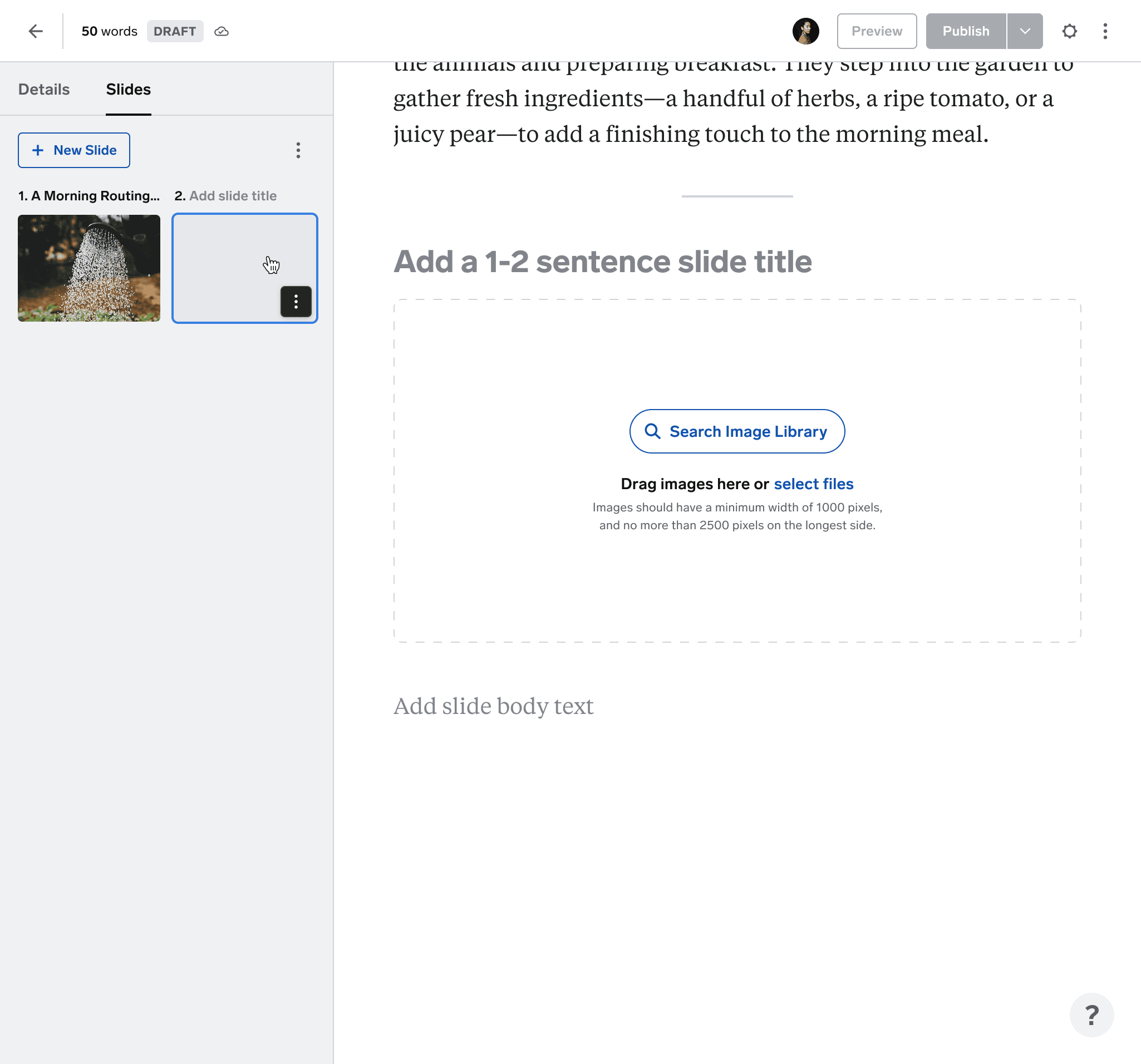
When I joined Business Insider, image management wireframes had already been drafted by another designer. The team had deprioritized modal interfaces out of concern they might “block the writing space, ” an assumption that was never validated with editorial users. Nevertheless, the small, inline popover UI was implemented with minimal functionality.
The challenge
Early usage revealed critical breakdowns:
• Users couldn’t easily locate recent uploads or identify images from the minuscule thumbnails
• Editing metadata was tedious and cramped
• Publishing errors rose due to disjointed image placement and selection
• The “don’t block writing space” rule turned out to be irrelevant; editors prioritized focus over always seeing their draft
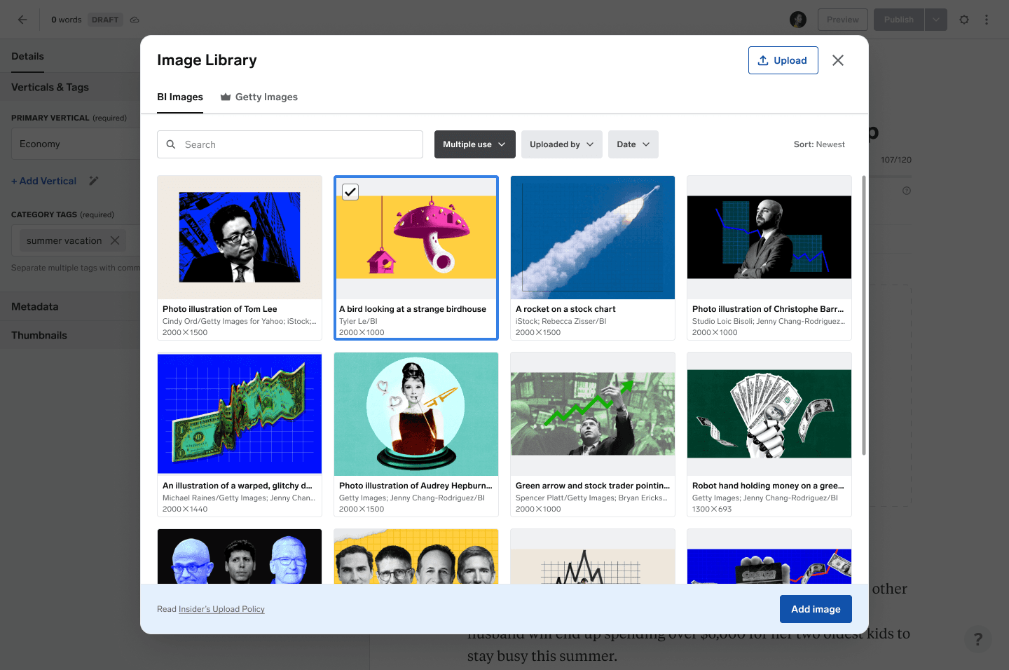
When we had the opportunity to revisit the experience, I leaned into our newly adopted side-panel pattern, placing the image library in a left panel, and image uploading and editing in a right panel.
This version
• Aligned with metadata and version history conventions
• Reduced overlap with the writing canvas
• Reused UI components efficiently
But ultimately, it created a fractured experience: jumping between opposite panels disrupted focus and introduced new friction.
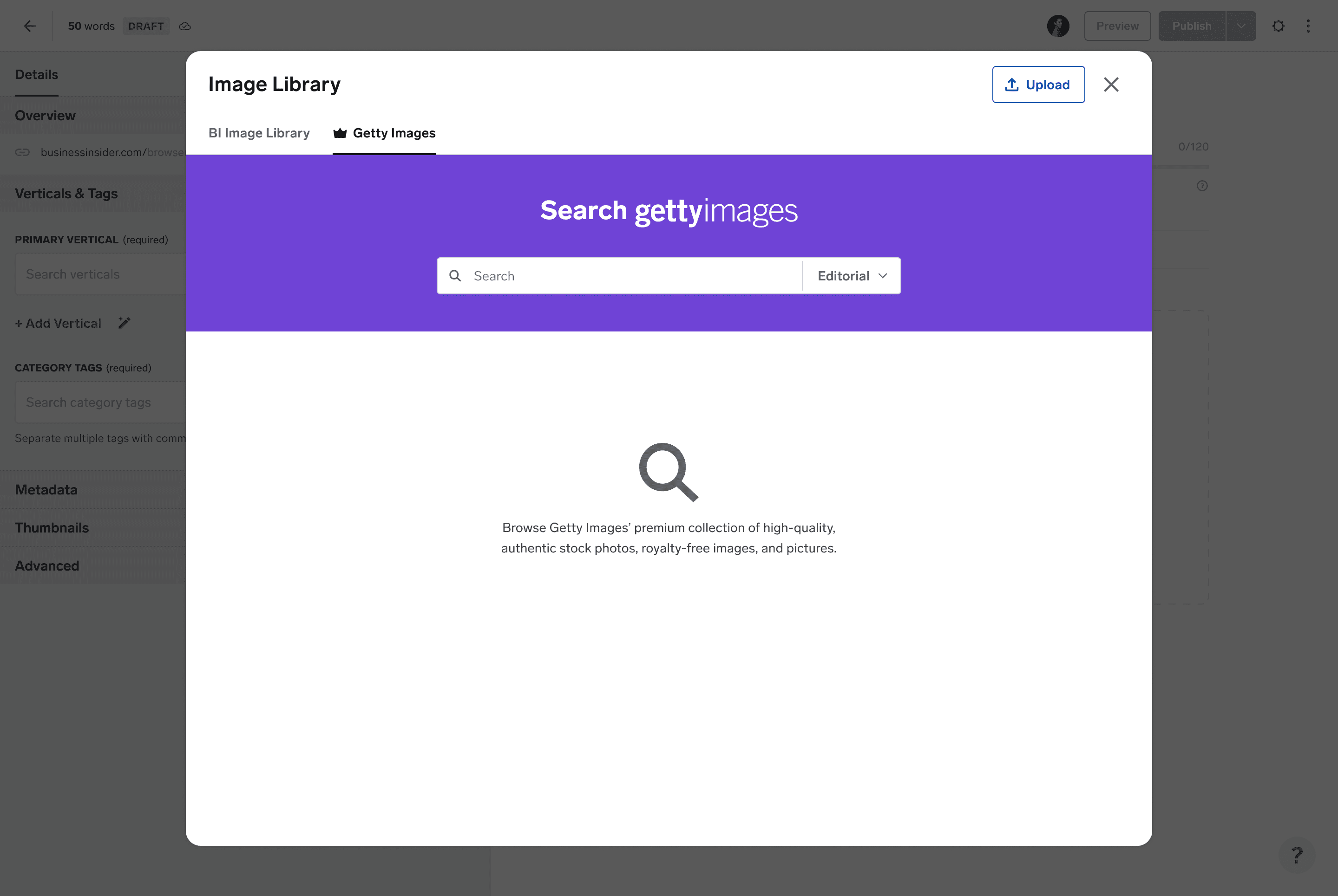
After the MVP’s weak reception, our now more aligned team was determined to get image workflows right. I revisited the legacy system’s full-screen modal—this time, with deeper understanding and intent.
The final version
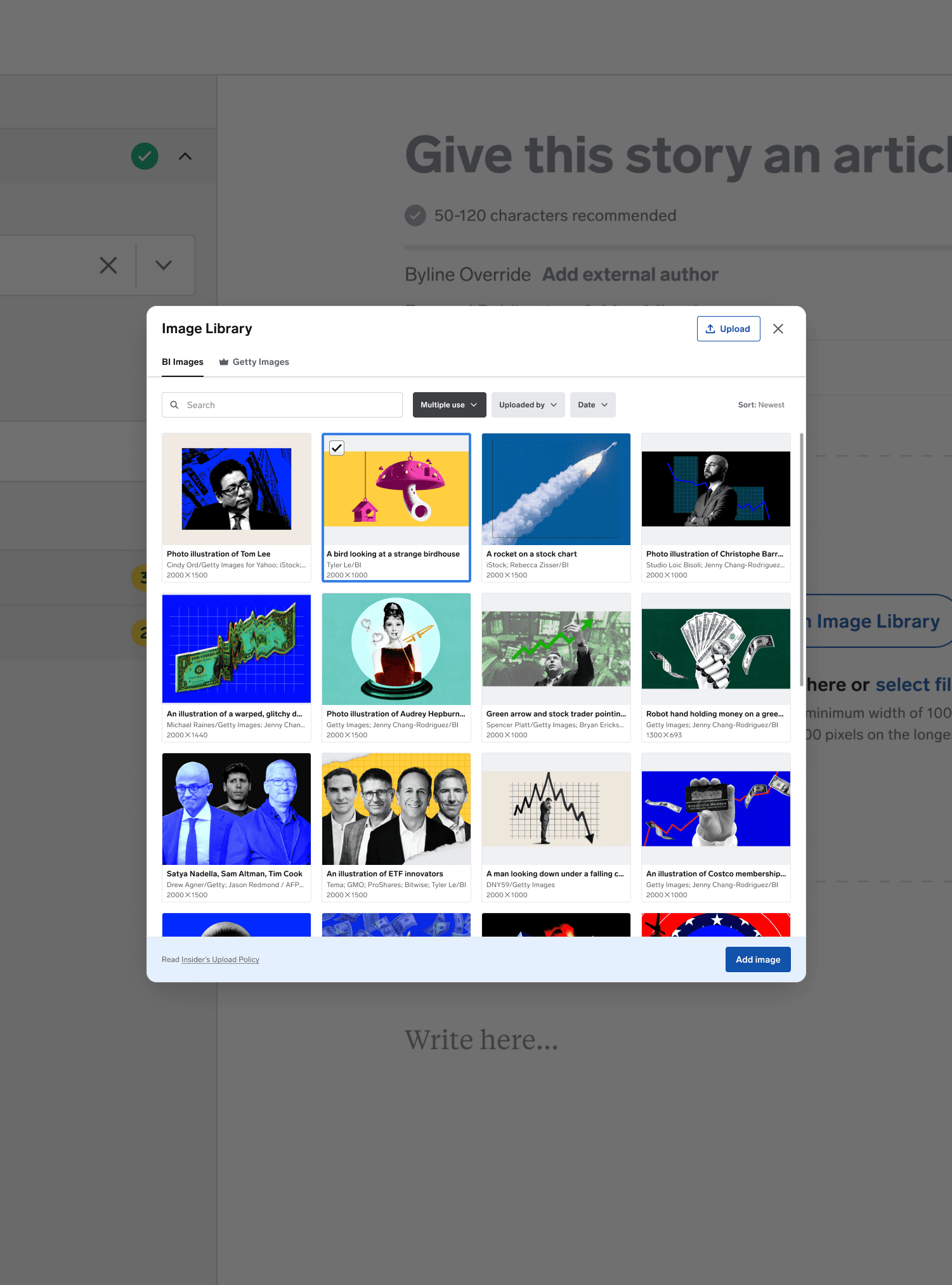
• Prioritized clarity with large thumbnails and file context
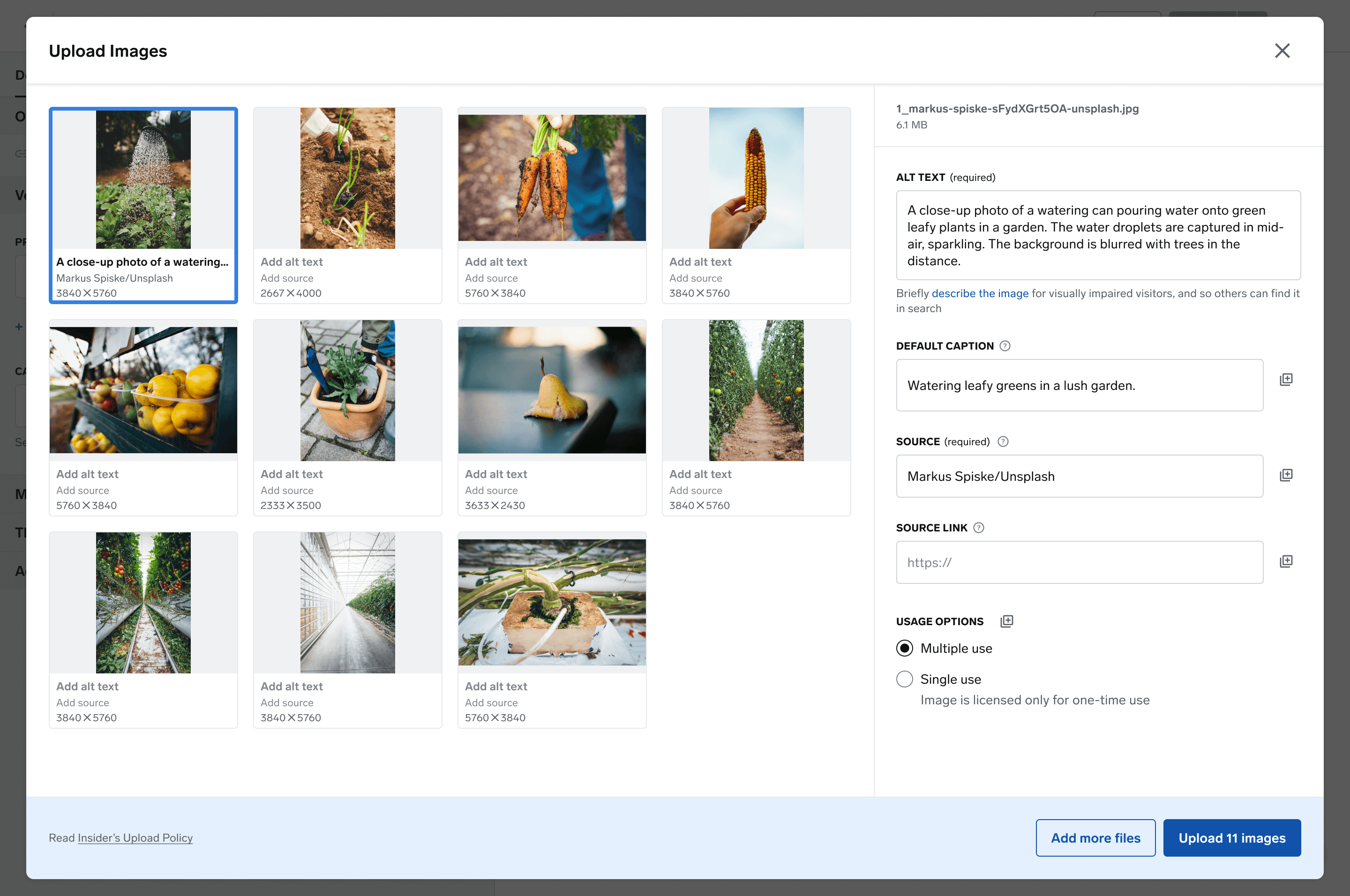
• Enabled faster drag-and-drop and accurate bulk uploads
• Integrated seamlessly with slideshow and metadata workflows
• Reused design system components to keep engineering velocity high
Instead of blocking the writing space, the modal became a purpose-built flow,giving editors the dedicated focus they’d been missing all along.
Each iteration brought us closer to what editors actually needed: focus, control, and speed.
Before launch
Legacy CMS
Clunky and disconnected. Editors had limited control over images and metadata, with no support for bulk actions.
Inherited popover wireframes
Based on the assumption that modals were disruptive and "blocked the writing space." Small, cramped, and never validated with editors.
After launch
Launched MVP: panel-based
My first iteration used dual side panels for browsing and editing. It aligned with CMS patterns, but created too much split attention and friction.
Final redesign: full-screen modal
Editors needed focus, not visibility of their draft. This dedicated workspace made room for bulk actions, large previews, and smoother workflows, resulting in a 92% drop in complaints.
Bulk image upload reduced image prep time.
Slideshow builder enabled rich, high-traffic formats.
Getty Images integration eliminated re-upload friction and improved legal compliance.
🧯 92% drop in image-related complaints
⚡ 5x increase in CMS publishing velocity
📰 35% of stories published via the CMS, up from 7%
📈 Contributed to CMS powering 93% of site traffic by 2024
What I'd do differently
Validate assumptions early—especially those inherited from prior design decisions
Run more contextual research up front to understand editors' real priorities
Push for clarity in design principles sooner to avoid reactive pivots
Upcoming opportunities
Expand usability testing under high-volume newsroom conditions
Introduce smart image tagging that auto-detects content to suggest tags on upload
Add CMS-native image editing, such as brightness, contrast, and branded annotations
