How I built Business Insider’s CMS component library from scratch, creating scalable infrastructure that accelerated design, development, and cross-functional alignment.
🧩 Problem
BI’s CMS team had no design system, just scattered wireframes and a stale, outdated org-wide library. With no reusable components or standards, designers and engineers were rebuilding from scratch every time.
Design leadership hadn’t yet defined a CMS design language, but frontend development had already started, so early wireframes were shipped directly into production. Some are still live today.
💡 Solution
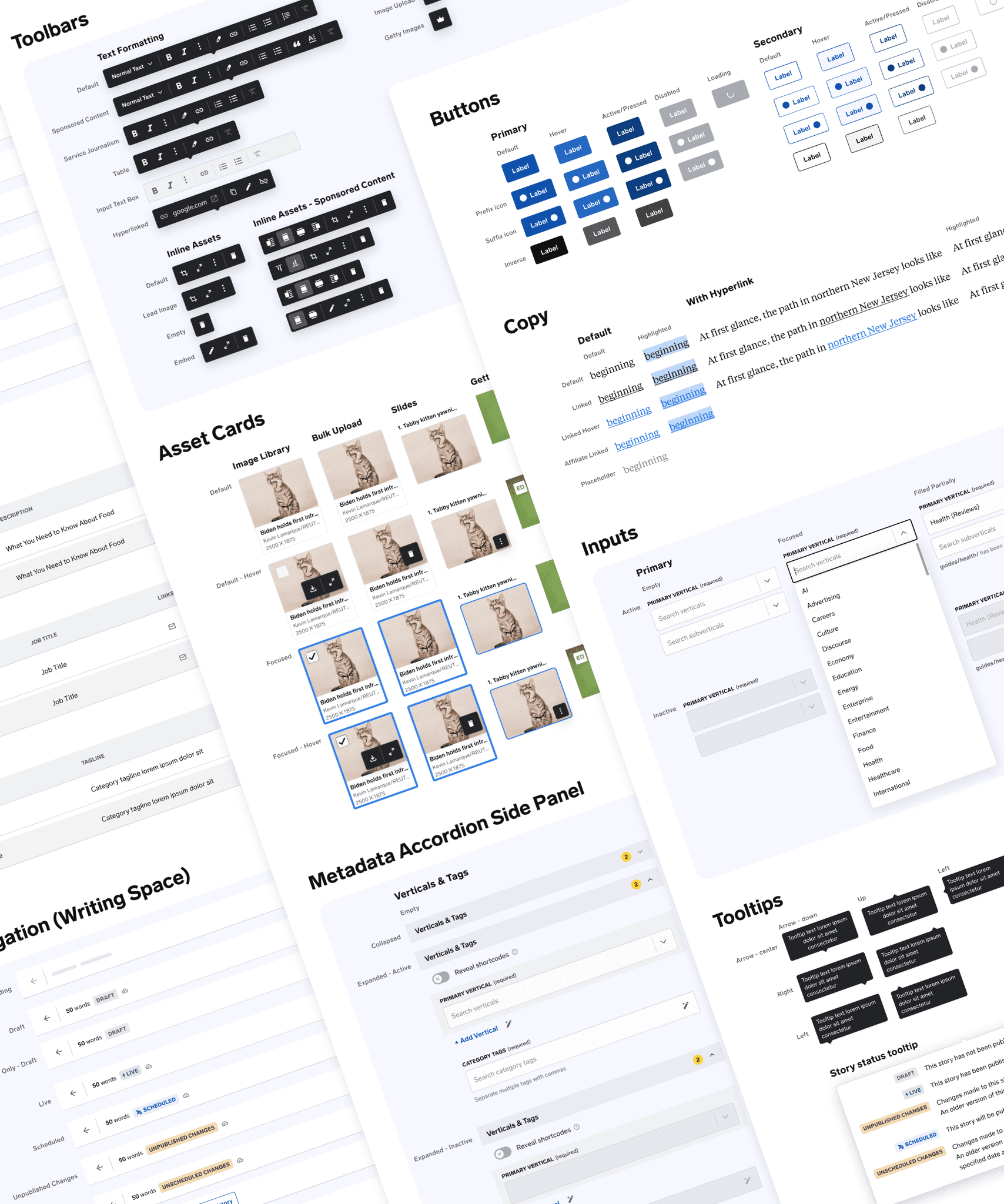
I built a scalable, Figma-based CMS component library tailored to the CMS, from the ground up. I designed variants, states, and real editorial workflows, aligned patterns with engineers, and made the library a single source of truth across design, product, and engineering.
📈 Outcome
The system cut developer time by 20%, reduced visual QA bugs by over 90%, and became the UI foundation for CMS features. It’s been adopted by 3+ designers and helped influence broader design ops efforts across the org.
The challenge
I joined as the first embedded designer on the CMS team, stepping into early wireframes, loose research, and no plan for reuse. There was no component system, no shared language, and no scalable structure.
Design infrastructure wasn’t a priority yet. I was told components weren’t needed since I was “just wireframing,” even as engineering began building without aligned standards.
Some of those early wireframes shipped as-is, resulting in inconsistent UI and long-term maintenance overhead.
The org-wide component library technically existed, but it was outdated, lacked core states, and saw little adoption.
What I drove
Built the foundation
Created scalable, variant-ready components for real editorial workflows. Structured the library for scale with clear naming, logical categories, and lightweight documentation.
Sweated the states
Designed full interaction coverage across inputs, buttons, and filters including hover, focus, disabled, and error. Structured form elements for clarity, accuracy, and handoff ease.
Designed for reuse—even solo
Prioritized maintainability from day one, refactored early work as the system matured, and upheld consistency even when I was the only designer using it.
I built a scalable token system using Figma variables—starting with foundational primitives and mapping to semantic UI tokens. Enabled multi-mode theming (e.g. light/dark) and accelerated cross-team adoption of the new CMS component library.
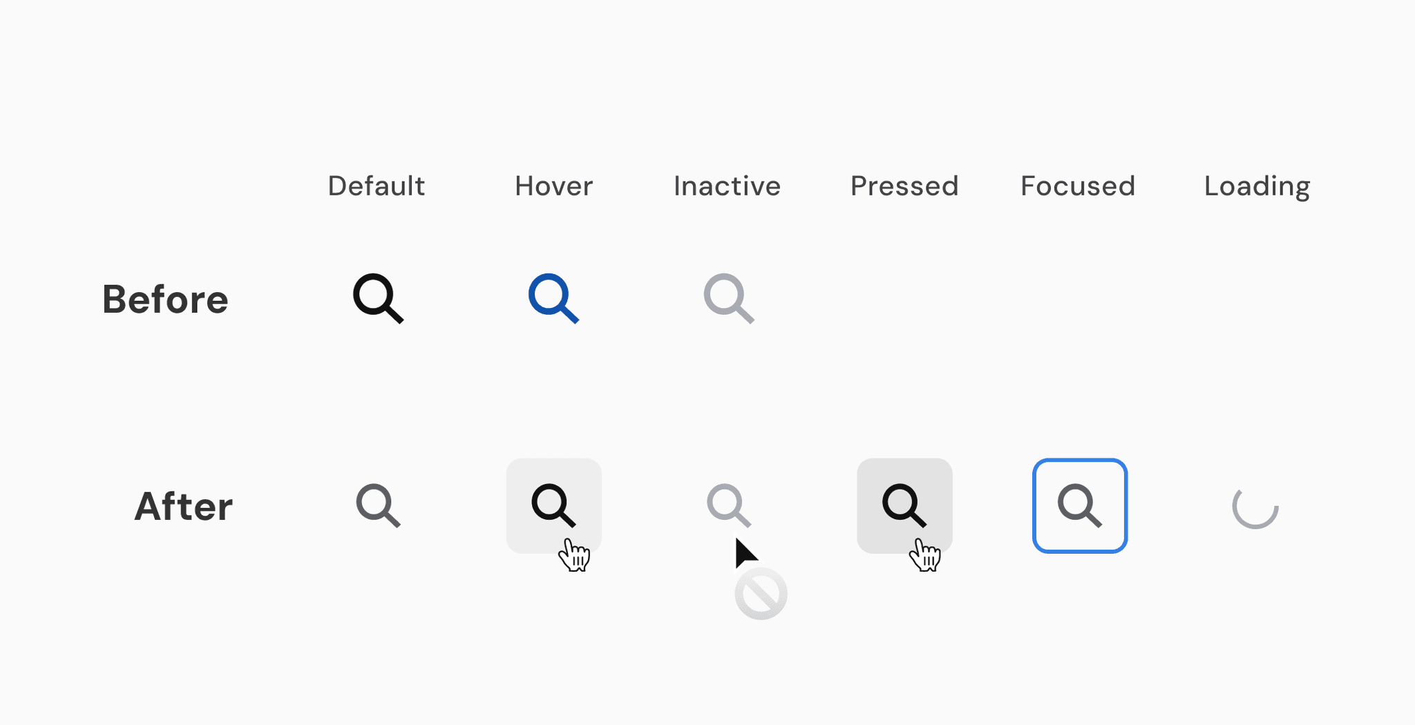
I redesigned a low-affordance icon-only button by introducing defined states, background fills, and cursor cues—improving clarity, accessibility, and interaction responsiveness
Cross-functional partnership
When a Storybook integration wasn’t feasible due to engineering constraints and third-party libraries, I made the Figma library the next best thing: a shared source of truth used across product, design, and engineering.
The system became a reference point in Jira tickets, Slack threads, and daily standups. It clarified design logic, sped up alignment, and drastically reduced downstream QA issues.
Together with another systems-minded designer, I co-led a proposal to raise the bar across product teams. We recommended two shifts:
1.
Modernize the org-wide component library to reflect real frontend use
2.
Shift Figma from sprint-based to feature-based file organization
Leadership wasn’t ready to invest yet. Without shared ownership, teams defaulted to scattered, outdated components with inconsistent behavior and unclear states. Design files were hard to find. Work had to be rebuilt.
A company-wide rebrand eventually reprioritized systems work. Foundational styles (typography, color, icons) shipped, but core components remained unfinished. Buttons lacked hierarchy. Mobile and service journalism formats were left untouched.
Meanwhile, the CMS system I built was already in use—functional, adopted, and powering daily work across design, product, and engineering.
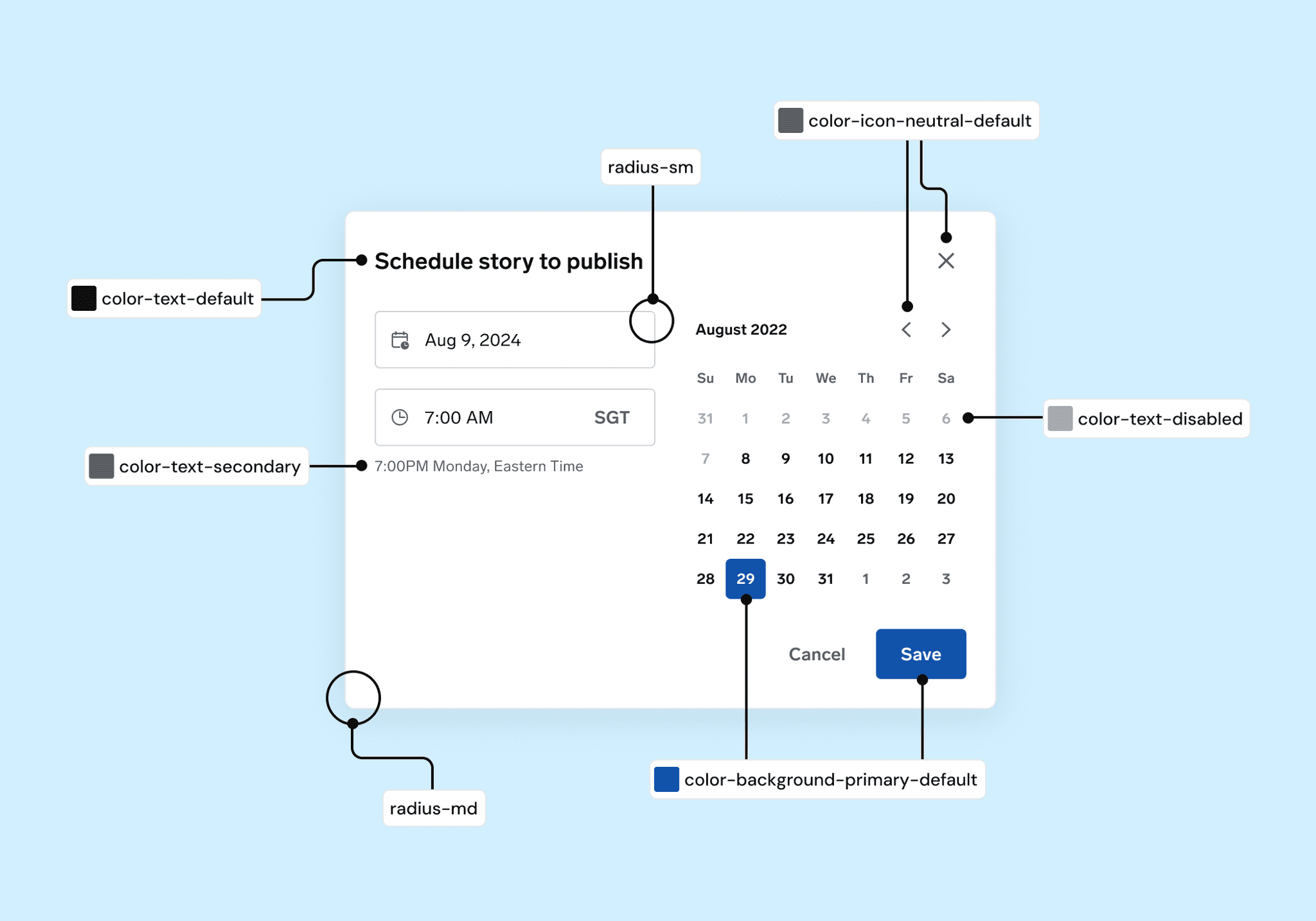
Applied semantic and structural tokens to CMS scheduling tools—using consistent color and radius primitives to drive clarity, and scalability.
The CMS component library wasn’t just a design artifact—it became an embedded part of how the team worked. Referenced in Jira, shared in Slack, and reused across files, it helped teams move faster and stay aligned.
Measurable impact
🚀 20% faster development due to reusable components
🧯 92% drop in QA bugs related to UI inconsistencies
👥 Used by 3+ designers across CMS initiatives
🔧 Became the UI foundation for all CMS features
What I'd do differently
Document contribution rules earlier to support scaling
Make system gaps visible as cross-functional blockers, not just design debt
Frame infrastructure work as a velocity multiplier to improve buy-in
What's next
Expand coverage to support more edge cases and UX states
Define lightweight governance for cross-designer contributions
Revisit design-code alignment for high-traffic CMS surfaces where consistency matters most


