An opt-in AI assistant that helped editors move faster on metadata—without giving up authorship. Born during Hack Week, built to last.
🧩 Problem
In early 2023, generative AI was just hitting the newsroom—and trust was fragile. Editors at Business Insider worried about losing creative control or finding AI-generated content injected into their stories without consent.
Meanwhile, tedious metadata tasks like URL slugs, summaries, and tags were time-consuming but critical. And no one had yet defined what “editorial-safe AI” should look like.
💡 Solution
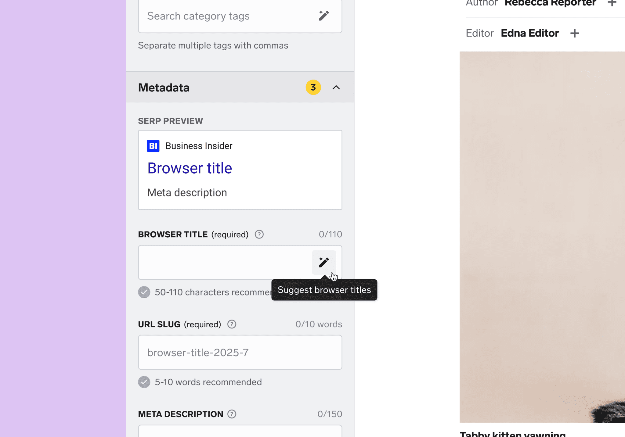
During BI's internal “Hack-AI-Thon,” I designed an opt-in AI assistant directly into the CMS. A sparkle pencil icon button next to each field let editors generate suggestions on demand. Nothing appeared until selected, and everything was editable, preserving control and consent.
Post-launch, I refined the UI to align with our evolving design system (which didn’t exist during Hack Week), clarified consent language, and scaled the pattern to support story summary bullets.
📈 Outcome
The assistant became the first generative AI feature in Business Insider’s CMS. It launched quietly—no announcement, just adoption. Editors across desks still use it in 2025 to save time, improve consistency, and retain authorship.
It also proved a key principle: in a skeptical newsroom, trust—not hype—drives adoption. Because it stayed out of the way until invited in, editors embraced it.
A year later, we scaled it to article summaries, validating that a trust-first interaction model could expand deeper into editorial workflows.
Team
1 PM, 7 engineers, SEO and editorial partners (5+ stakeholders)
Timeline
March 2023: Hack Week prototype
April 2023: Metadata assistant shipped
February 2024: Expanded to story summary bullets
Hack Week prototype: Editors clicked the sparkle pencil to generate metadata suggestions—always on demand.
Key Design decisions
Opt-in by design
I chose a sparkle pencil, not a wand—to signal help, not magic. Editors clicked it to generate suggestions in a popover. No suggestions appeared by default. Nothing auto-inserted. Every action was explicit and editor-controlled
One interaction pattern, many fields
I designed a single, scalable interaction model: one icon, one behavior, one UI across all supported fields. This reduced engineering lift and avoided editor retraining. It later scaled to categories, verticals, and summary bullets.
Launching quietly, tracked deliberately
Given internal tensions (recent layoffs, low morale), we skipped an announcement. Instead, we monitored adoption through analytics and partnered directly with trusted editors for feedback.
Constraints and tradeoffs
Every decision in this project was made with trust, clarity, and sustainability in mind, even when it meant skipping more advanced or familiar patterns.
No chat-style refinement
Full chat functionality was intentionally out of scope due to cost and engineering complexity. Instead, we focused on on-demand suggestions via a single-click interaction—fast to build, easy to use, and aligned with editor expectations.
No empty-state guidance
The AI assistant only worked once the story body was populated, but the UI didn't explain that. In hindsight, I'd add lightweight messaging to clarify this prerequisite and avoid silent failures.
A year later, the same opt-in model powered story summary bullets, proving the interaction could grow without added complexity.
Senior Product Designer
I led end-to-end UX/UI from Hack Week through production and expansion.
What I owned
• Shipped original UI and interaction model
• Created scalable patterns used across six field types
• Designed editorial trust safeguards
• Partnered with SEO and editorial leadership
• Iterated post-launch to align with our design system
What I'd do differently
Balance stealth with feedback
Quiet rollout built trust, but limited early learnings. I'd build in team-specific check-ins earlier.
Make space for polish, even when it's not urgent
I refined the UI post-launch (cleaner modals, clearer language), and in hindsight, I'd frame that work as long-term design system investment.
Surface ambiguity earlier
Without existing editorial AI standards, we made them up on the fly. In doing so, I saw how unreliable "quality" can be. ChatGPT didn't reliably count characters, and prompts weren't meaningful without shared success criteria.
This reinforced a core principle: In a newsroom, AI should draft—not decide.
Updated design: Clearer consent language and alignment with our evolving CMS design system.


